Over the past year, we’ve been hard at work making ruzuku into a powerful, but easy-to-use platform for your courses and learning communities. We’ve added capabilities that make it easy to structure and create your courses (visual course outlining tool; attaching files & embedding content), and help keep your participants engaged (checklist of activities; email reminders; “Course Health” view for checking in on participation levels). Read our recap of recent improvements to ruzuku for more information.
So, what’s next for ruzuku?
We’ve heard dozens of suggestions from our current customers via email, phone calls, and customer support requests. And we’ve developed a few of our own ideas based on and our own experiences participating in ruzuku-based learning communities (as both students and Guides).
While nothing is set in stone, there are three major challenges we’re currently focused on — look for improvements in these areas to roll out over the next few months.
Simplified navigation
A common request we get is to make it easier to navigate around ruzuku, especially for students who haven’t used the platform before.
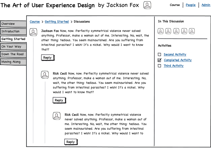
We’re currently working to simplify and clarify how our navigation system works. Here’s an initial concept of where the design is headed:

In this design, we’re making the step-by-step course outline much more prominent on left. The course outline will now be the first thing new students see, rather than the current task-based navigation (Overview / Activities / Discussion / People). While we need to test this design in the real world to verify its effectiveness, our hope is this approach will be more obvious and intuitive.


