Big changes are afoot here at Ruzuku. We’re redesigning the course pages to help better guide students through the learning process.
Today I’m sharing the new activity page designs (you can see the life-size version on Forrst):
Most of the changes involve streamlining the information presented on this page to help students focus on the content and adding more visual hierarchy to the discussion area of the activity.
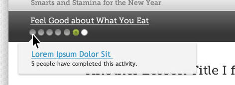
The biggest change is the new progress bar, which will help students orient themselves in relation to other activities. Each dot represents a step. Grey ones are completed, white ones are not completed, and the green one represents your current activity. Hovering over a dot brings up a tooltip which shows the name of the that step:

This was a more experimental feature we were toying with. It was inspired by the progress bar used in eReaders like the Kindle that help readers see where they are in a book or a chapter. Originally we weren’t planning on implementing it so soon, but it tested so well that we decided to include it in this first phase of the redesign.
As always, we welcome your feedback and comments! More sneak peeks coming soon!


