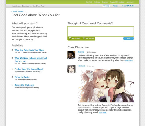
Hi, it’s Rachel again! Continuing to share our redesign progress, today I bring you the new “step page” design (bigger version here):
‘Steps’ represent modules or topics in a course. This Step in a health coaching course is titled ‘Feel Good About What You Eat.’
Here we’ve given the list of activities more prominence so it’s more apparent to students where they are within the step and what they have to do to move forward. Additionally, we’ve switched from checkboxes (which allowed students to complete an activity without visiting it) to “progress dots” (the same ones used in the progress bar on the activity pages themselves). We’ve also removed the pictures of the the people who have completed the activity and replaced them with text such as “You and 5 other people completed this activity.” In testing, this proved less distracting for learners.
The discussions will each have their own page for further content and replies, which you can get to by clicking the “read more” link. In the current design, all those replies are on the step page and in your face. It was getting a little hectic out there! So this should tidy that up nicely.


